 ENG
ENGTOP

ABOUT US
CI
Brand Identity Statement
NEOTEC ENC is a smart construction solution company that realizes “Infinite Drive Toward New Technology” through future-oriented construction technologies and sustainable material development.
-
KR

-
EN
-
KR

-
EN

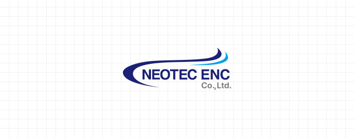
CI Concept
NEOTEC ENC’s corporate identity visually expresses the company’s core values of technological advancement, reliability, and scalability.
The dynamic form centered on an upward curve signifies the brand’s growth potential and continuous innovation, while precisely designed lines and colors emphasize engineering sophistication and trustworthiness.
Key Elements & Meanings
-

-
Upward Curve
Symbolizes the brand’s vision and future-oriented growth.
“Infinite growth potential based on superior technical capability.”
-

-
Sharp, Dynamic Finishes
Emphasize precision, driving force, and technical completeness.
“A visual symbol of accuracy, dynamism, and professionalism.”
-

-
Blue Tone Palette
Conveys calmness and stability while reinforcing technical reliability.
“A fusion of cool engineering sensibility and smart technological capability.”
Color Palette
Bright Blue #00A0E9
- R : 0
- G : 160
- B : 233
- C : 100%
- M : 31%
- Y : 0%
- K : 9%
Deep Blue(Main) #1B2176
- R : 27
- G : 33
- B : 118
- C : 77%
- M : 72%
- Y : 0%
- K : 54%
Black #111111
- R : 17
- G : 17
- B : 17
- C : 0%
- M : 0%
- Y : 0%
- K : 0%
Gray #727171
- R : 114
- G : 113
- B : 113
- C : 0%
- M : 1%
- Y : 1%
- K : 55%